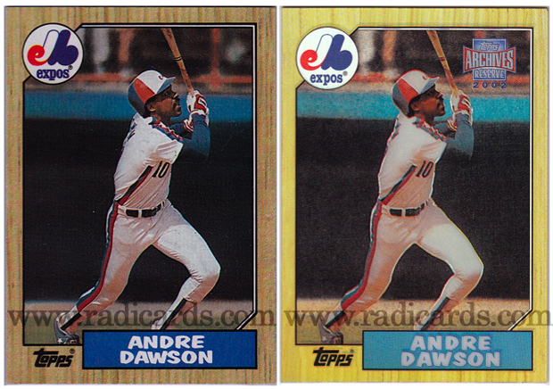
Some designs are so classic that they get reintroduced into the hobby years, sometimes decades later. The classic 1987 Topps design was brought back to life in 2002 but with a twist. The original 1987 release on the left was printed on dark cardstock which was indicative of its time. That ’87 design featured a rich wood-like frame with vibrant team logos that followed suit with the color scheme of the box which houses the players name. The 2002 Topps Archives Reserve
release on the right however uses the same template from the 1987 release but adds a beautiful refractor finish, an updated Topps label on the upper right corner and is printed on white glossy card stock. This card is worth 16x that of the original card on the left. Just goes to show you that an original is not always more valuable than a reprint.
To shop for cards from 1987 Topps, click here.

 Have you visited our store? Click here.


Love the compare and contrast! I remember bustin’ packs of ’87 wax… I always felt that the wood border was a nostalgic spin on the Hall of Fame endowed ’62 set. As usual, Chrome brings it to the next level.
Thanks, Anthony. I feel the same about the throw back to the classic ’62 set. Chrome just makes it even more exciting. Good call, man! 🙂