
Previously, I shared redesign thoughts for some 1990s parallels. Now it’s time for parallels from the 2000s decade. While these 10 cards stood out to me, someone else could think differently. Ultimately, however, there are cards out there for all of us that make us think:
- What if they had designed the card this way??
- What if they did this in my sport??
- What if this card were serial-numbered to ___??
This time around, the spotlight is on parallels from the 2000s decade. The Insert Mania and explosion in innovative card design/technology that captivated collectors in the 1990s were still driving the Hobby at the turn of the century. However, card companies in this era began to shift their attention to game-used memorabilia (i.e., jerseys, patches, bats, balls, hats, pants, etc.). Instead of developing cards that mimicked baseball equipment, Donruss/Playoff, Fleer, Upper Deck, and Topps used the actual sources of their design inspiration on the cards themselves. Specifically, swatches of jerseys and patches, slivers of bat pieces, and skins of baseballs slowly became a feature for each product release until they were the primary highlight of almost every release by the mid-to-late 2000s. This movement, which started in the 1990s, forever changed the landscape of the Hobby and still drives it today. However, the changes had collateral damage which left inserts and parallels by the wayside as production budgets were largely spent on securing game-used pieces and planning card design around these materials. Thus, there were more parallels during this decade that made me think, what if?? than in the 1990s, which was great for writing this piece!
This kind of thought constantly crossed my mind while growing up in the 1990s and was in overdrive during the 2000s. Being (pleasantly) overloaded with intricate die-cut, holofoil, etched foil, Dufex, and acetate designs for base, inserts, and parallels during the 1990s was awesome but also spoiled me going into the new millennium as I kept my expectations high. While the Hobby landscape changed during these years, I still longed for representations of my favorite card collecting era and the plethora of releases during these 10 years provided plenty of product to muse on.
Thus, my personal parameters for re-evaluation:
- All of these ideas were founded on a base parallel (i.e., no parallels of inserts) that already existed.
- Suggestions were design tweaks/alterations and/or rarity modifications
- Attempted to keep modifications within the zeitgeist of the time (e.g., no bat barrels for early-2000s cards, Superfractors prior to 2004, etc.).
- Reviewed pack-pulled and officially licensed parallels from this era and only inserts will get attention in due time.
In no particular order:
1. 2000 UD IONIX RECIPROCAL
Source of inspiration: 2000 Topps Tek Architeks
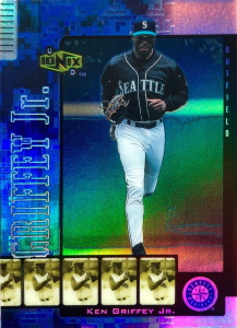
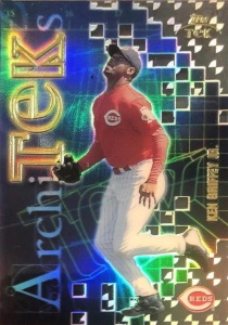
2000 UD Ionix was the second iteration of the short-lived but popular Upper Deck brand that utilized science, chemistry, and computer technology-themed aesthetics and nomenclature for its cards. In both years, chase cards ranged from easy to very difficult to pull, which brought attention and demand to the set, beyond its popular design motifs. The lone parallel, Reciprocals, were unique as they were true to name and inverted each player’s base card picture and team color so the background image/color became the feature and the foreground player image was relegated to the backdrop. They were also given a holofoil finish for further distinction from its base counterpart.
However, unlike the 1999 release, there was no low serial-numbered Reciprocal parallel. Further, while I enjoyed the design, seeing what Topps did with its 2000 Topps Tek Architeks insert that shared a similar theme made me think they could be even better. Thus, imagine these 2000 Reciprocal parallels with a cube/block-like die-cutting in the upper left corner to match the surface design etching, gold holographic foil, and a serial-number to 100. The appreciation for this parallel and brand as a whole could have been even higher and at the very least, would have left collectors with a memorable rarity from its final offering.
To shop for cards from 2000 Topps Tek, click here.
2. 2003 FLEER SHOWCASE LEGACY
Source of inspiration: 1998-99 Fleer Classic ’61 Basketball
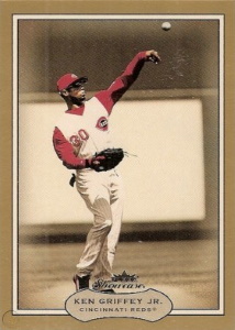
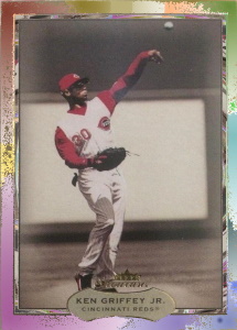
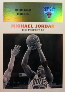
Fleer seemingly went with a retro-themed design for its 2003 Showcase product, featuring muted-tones of reds, greys, and browns in the card borders, sepia backgrounds, and full-color player photos for contrast. The result was a base card that was remarkably simple, pulling the attention of the viewer to the player’s action shot amidst the secondary backdrop. The Legacy parallels differed only in that they featured a gold border. However, this minor distinction, while on-brand with the theme of the set, left me wanting more and thinking of how tweaks could be made that still preserved the classic feel of the set.
Enter the 1998-99 Fleer Classic ’61 parallels from basketball. These parallels honored the 1961 Fleer basketball set and added a modern touch of holofoil to the colored upper of the card, resulting in a brilliant juxtaposition between the grey/white action photo, vibrant color background, and holographic foil. Translating this harmony to the 2003 Fleer Showcase Legacy parallel set: imagine these parallels with a holographic foil over the main gold border, a multi-color marble foil (see mockup above, middle card) over the inner border, and reducing the print run to 50 (instead of 150). The result would be similar to the Classic ’61 parallels from basketball, an old-fashioned design with a contemporary finish that cohesively makes the parallel stand out appropriately both in structure and rarity.
To shop for cards from 1998-99 Fleer Classic ’61, click here.
3. 2005 FLAIR ROW 1
Sources of inspiration: 2000 Pacific Vanguard Holographic Parallels
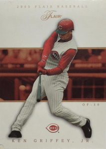
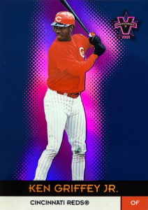
A theme that collectors commonly saw in parallels across card companies during the 2000s was a simple foil-color change, regardless of product or company, and the 2005 Flair Row 1s were probably the poster-child for this design. 2000s Fleer products were notorious for having multiple parallels within and across multiple brands with either a colored foil variation or small colored stamp for differentiation between the base card. Specifically, 2000 Fleer Focus Masterpiece Manias, 2001 Fleer Triple Crown Reds/Greens/Blues/Purples, 2002 Flair Collections, 2003 Fleer Genuine Ascendings/Descendings, and 2004 Fleer Showcase Legacies were all prime examples of this across multiple years. Upper Deck (2005 Upper Deck Exclusives) and Donruss/Playoff (2002-2005 Leaf Press Proofs) also used these colored foil changes for parallel differentiation, which was the norm for parallels during this decade. While this was most likely a result of card companies focusing their design attention on game-used and autographed offerings, the lack of ingenuity for these was noteworthy to me, mostly because of how common a practice it was for card companies.
However, the Flair brand has a storied history of simple, yet beloved and elegantly designed parallels thus, only a few alterations to this parallel are proposed. Imagine these Row 1s with a holographic, team-colored center, holographic foil text (i.e., nameplate, position, jersey number, team logo, and brand), and a holographic foil-shadow that already outlines the player photo, as Pacific did with its 2000 Vanguard Holographic parallels. These slight changes would bring subtle pops of flair (pun intended) to the card that would contrast nicely with the prominent white background, utilize the card technology that brought the brand prominence in the late 1990s, and still align with the less is more theme that the Flair design team may have been aiming for originally.
To shop for cards from 2000 Pacific Vanguard, click here.
4. 2000 E-X ESSENTIAL CREDENTIALS NOW/FUTURE
Source of inspiration: 1999 E-X Century
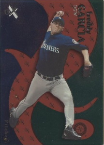
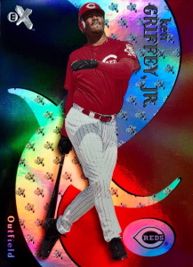
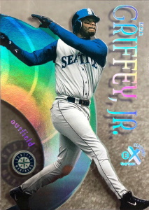
2000 marked the end of an era at Fleer/Skybox as longtime design duo Jean and Earl Arena, responsible for the majority of amazing inserts and parallels for the company during the 1990s, left the company that year. This meant that the E-X sets largely responsible for elevating hobby appreciation would no longer be under their design direction going forward. Nonetheless, the first post-Arena year of the E-X brand was delightfully appealing with each base card featuring a team-colored and holofoil finish over an intricate, abstract-shaped design. However, the famous Essential Credentials Now/Future parallels from this particular year made me think of alternative finishes.
While I did not mind the frosted, matte finish over the team-colored sections, I took issue with the silver holographic center area being replaced with an opaque blue acetate for the Future parallels or a red acetate for the Now parallels. It worked for some cards (i.e., players with team colors that paired well with red or blue) but not for others and the overall look seemed too simplistic for a parallel with incredible design history. Thus, imagine these 2000 E-X Essential Credentials Now/Future parallels with the same team-colored, brushed foil finish, but with a clear acetate center and black holographic E-X logos for Nows and white holographic E-X logos for Futures. These changes would maintain the original design foundation while incorporating neutral tones that pair with all team colors and pay tribute to its forefather 1990s Essential Credentials sets.
To shop for cards from 1999 E-X, click here.
5. 2007-09 TOPPS TRIPLE THREADS PARALLELS
Source of inspiration: 2006 Topps Triple Threads Parallels
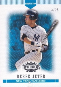
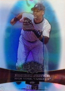
2006 Topps Triple Threads was an inaugural release that used relic chunks and die cut windows to spell out catchy phrases. Defined by color, each parallel featured a matching holographic background tint that complemented the white boarders of the card. However, the subsequent releases for the remainder of the decade and into the 2010s featured parallels that lacked this holographic foil. Instead, the color remained the but the shine was removed, leaving a white and respectively colored canvas-finished card.
Maybe this change was due to budgetary constraints or because designers did not want to take attention away from the game-used relic cards. Whatever the reasoning for this change after 2006, I would have preferred seeing the 2007-2009 Toppe Triple Threads parallels with a colored holographic foil to match the gaudiness of the relic inserts and give the holofoil-spoiled 1990s collectors more to appreciate and chase within this set.
To shop for cards from 2006 Topps Triple Threads, click here.
6. 2005 STUDIO PLATINUM PROOFS
Source of inspiration: 2000 Fleer Showcase Legacy Collection

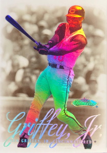
The Proof parallel has been a staple with the Studio brand since it was introduced in 1996. In addition to its longevity, this parallel was also known for its straightforwardness, usually featuring multiple precious metal-colored holofoil player nameplates and/or a Proof stamp featuring the same finish. This no-nonsense design was successful mostly because of the photography and background the Studio name and brand was modeled after every release since its debut in 1991 (except the 1995 release) featured a portrait or non-action close-up shot of the player, with the 2000s releases featuring a player-themed backdrop (e.g., home stadium, city skyline, etc.).
With the photography and/or backgrounds being the centerpieces of each release (again, except for the 1995 offering), adding an additional design element for the parallel set would most likely have taken away from these focal points and may also explain the reasoning for its simplicity. I enjoyed these over the years, 2005 especially, but this particular year made me think – what if Studio had pushed just a little further – without distracting from the overall theme of the card? Thus, imagine these 2005 Studio Platinum Proofs with the same background and platinum-hued holofoils but with a similarly-colored, holographic player photos like we see in 2000 Fleer Showcase Legacy Collection parallels. The white and team-colored skyline backdrops would remain intact, along with the mainstay holofoil stamp, but would have a clear distinguishing feature from the Silver and Gold Proofs, while still maintaining the essence of the parallel.
To shop for cards from 2000 Fleer Showcase, click here.
7. 2004 E-X ESSENTIAL CREDENTIALS NOW/FUTURE
Source of inspiration: 2003 E-X Essential Credentials Now/Future
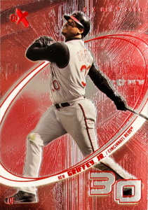
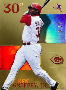
Due to Fleer’s bankruptcy in 2005 and subsequent buyout by Upper Deck, 2004 marked the end of the E-X brand. While other former Fleer brands (e.g., Fleer Tradition, Ultra, Flair, etc.) continued under the Upper Deck name, E-X did not. By 2004, almost every product in the Hobby featured a vast array of game-used and/or autographed inserts or parallels that were marketed heavily (at much higher price points) to allure collectors. The 2004 E-X Essential Credentials set did not feature game-used material or autographs, possibly explaining why this parallel set, which was once the highlight of the brand, seemed like an afterthought from a design perspective.
These parallels featured a meticulously-detailed, team-colored etched-foil across the card front and an etched-foil oval in the center of the card that was colored blue for the Nows and red for the Futures. However, differentiation between the base and Essential Credentials parallel was essentially (pun intended) a change in the color palette. Remember your acetate roots! I thought to myself the first time I saw these, even as recent as the 2003 offering. Thus, imagine these 2004 E-X Essential Credentials parallels with the red or blue-colored etched foil oval but with the rest of the card outside the center oval a clear acetate featuring the same colored foil streaks emanating from the center origin. The blue/red color distinction would remain, standout distinctively without clashing with any incongruent team color, and result in an awesome looking card, worthy of its name.
To shop for cards from 2003 E-X, click here.
8. 2003 FINEST UNCIRCULATED GOLD X-FRACTORS
Source of inspiration: Design modification & serial-number restructure
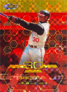
After a two-year hiatus, 2003 Finest featured a gold refractor parallel for the first time since its 2000 release, bringing back a parallel that was an annual staple for the brand from 1996-2000. This revival came with an added bonus as the parallel featured a parallel of its own: the X-Fractor. These debuted a new refractor technology that utilized a checkerboard holofoil with intersecting diagonal lines, giving life to the X-Fractor in design and in name. However, these 2003 Finest X-Fractors come in two variations: a base version that was serial-numbered to 99 and a gold version that was serial-numbered to 199.
This seemed counter-intuitive given the normal hierarchy progression of inserts and parallels. Traditionally, the gold refractor parallel was distinct from a base refractor parallel in design and rarity and thus, it seemed odd that the base X-Fractors were rarer than the Uncirculated Gold X-Fractors. Further, the gold refractor parallel traditionally also featured a deckled-edge die-cut around the entire card. While these were technically a different parallel, no base gold refractor existed for this set. Thus, a deckled-edge for the 2003 Finest Uncirculated Gold X-Fractors would be acceptable this one time (in my mind!). Imagine these Uncirculated Gold X-Fractors with a deckled-edge die-cutting around the edge à la the 1999 Finest Gold Refractors and a lower serial number than the base X-Fractors i.e., 49, etc. The result would be a revival of a popular design used for previous gold refractor iterations and fix the order of scarcity to a logical progression of Base card, Refractor, X-Fractor, and Uncirculated Gold X-Fractor.
To shop for cards from 2003 Finest, click here.
9. 2001 SPx SPECTRUM
Sources of inspiration: 1999 Ultimate Victory Parallel, 2000 SPx Spectrum Football
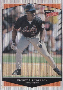
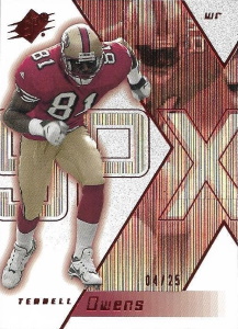
2001 SPx Spectrum parallels followed three consecutive years of being featured as a 1/1 from 1998-2000, setting my personal expectations for the 2001 rendition pretty high. Upon first reading about the product in the July 2001 issue of Beckett Baseball Card Monthly in the By the Box feature, seeing them being serial-numbered to 50 made me even more excited as they would no longer be a 1/1 and thus more realistically attainable for me and other collectors. When I finally saw one pop on eBay, I thought the seller had erroneously listed a base version for sale dishonestly, or out of simple confusion. However, at closer inspection, the card I saw was indeed a Spectrum parallel.
The only differences between the base and Spectrum parallel were thin trails of holographic gold foil that faintly traced lines around the card, the player nameplate, and team logo some truly would have to squint to notice. This same style was utilized in the basketball offering as well so similar thoughts could have crossed basketball collectors’ minds as well. Given that the Spectrum parallels were annually known for featuring a unique, patterned design, there was room for improvement on the 2001 set. One of the first ideas that came to mind stemmed from the 2000 SPx Spectrum parallels in football that had a holographic, vertical lines design that was nearly identical to the 1999 Ultimate Victory Parallel. Thus, imagine these Spectrum parallels with this thin-columned holographic finish on the outsides of the vertical lines and a holofoil finish within the inner parallelogram of the card. These two different and contrasting finishes would allow the Spectrums to stand out significantly from the base versions and feature a design that proudly represents its serial-numbered rarity.
To shop for cards from 1999 Ultimate Victory, click here.
10. 2001 FLEER FUTURES BLACK GOLD
Source of inspiration: 1996 Stadium Club Power Streak
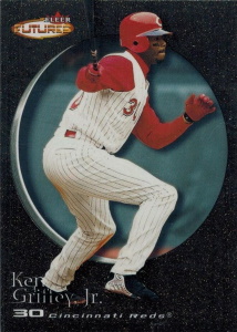
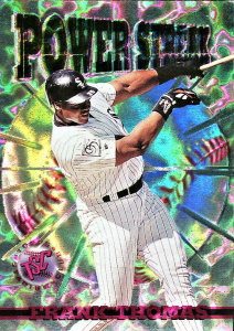
2001 Fleer Futures was a one-and-done product that emphasized young stars and historical veterans alike. In a seemingly unintentional blast from the past, the lone parallel in this set was a Black Gold chase that shared the same name as the popular and pioneering parallels from Topps in the early 1990s. However, unlike its moniker, the gold was largely missing from these cards, which shifted my imagination into gear to think of possible alternate designs.
The textured outer-design of the black is great but the center circle did not differ between the base and parallel. Thus, imagine these Black Gold parallels with an embossed, holographic center made to resemble a baseball similar to the 1996 Stadium Club Power Streak inserts but with a gold finish. These modifications would create an attention-grabbing parallel true to its name at a relatively attainable print run (499).
To shop for cards from 1996 Stadium Club, click here.
QUICK HIT SUGGESTIONS:
- 2000 Finest Gold Refractors: Give veterans low serial-numbers as well – Gold Refractors for the Rookies subset were /100).
- 2000 Pacific Prism Holographic Purple: Change the serial-number from 99 to 10 to mimic 2000 Vanguard Holographic Purple parallels – these were so vibrant in color, they deserve to be elevated in status through an even lower scarcity.
- 2004 Leaf Gamers Second Edition Quantum: While these possess a serial-number out of just 10, the only other differentiation between these and the Quantums is a black stamp on the front. Change the foil pattern, die-cut these in a certain way, or add a game-used item to the card, to make its rarity stand out more than just a stamp.
- 2004 Upper Deck Sweet Spot Limited: Similar to 2004 Leaf Gamers Second Edition Quantums, these are also serial-numbered to 10 and have minimal differentiation from the base. However, the only distinction between these and the base version is the serial-number stamp on the front left of the card. Some ideas might include: different foil finish or color design scheme, embossing, or a texture simulating a baseball. Any visual change for these would be welcome.
- 2004 & 2005 Absolute Memorabilia Gold Spectrums: Give these a gold-holographic foil finish to distinguish them more from its Silver Spectrum counterpart.
- 2000/2001/2003/2005/2008/2009 Upper Deck Exclusives/Gold: Upper Deck frequently featured a plain gold-foil change to the player nameplate/UD logo for differentiation across the 2000s, regardless of the name of the parallel. Perhaps give these Exclusives/Gold parallels a gold-tinted, all foil finish to the card fronts in addition to the gold-foil nameplate and UD logo.

 Have you visited our store? Click here.


