
Have you ever browsed through your personal collection, noticed a specific card, and thought, What if they had designed the card this way?? Maybe you came across a card design in a different sport and thought, What if they did this in my sport?? Or maybe looked at a card and simply thought, What if this card were serial-numbered to _??
Thoughts like these have consistently crossed my mind since I began collecting as a kid growing up in the 1990s. The diversity of, novel innovation in, and never-before seen technology used for card designs were defining characteristics of the Hobby during that decade and are still appreciated greatly today. The competition that arose between the assortment of card companies during that time period manifested through card technology and resulted in a luxury of seemingly endless options for us collectors. We were gifted the freedom to decide what card would become the proverbial apple of our eye and really breathed life into the to each their own saying that drives all of our collecting passions. Being (pleasantly) overloaded with intricate die-cut, holofoil, etched foil, Dufex, and acetate designs for base, inserts, and parallels was awesome. Collectively, these finishes sparked alternative design possibilities in my head while looking at showcases, walking down the physical aisles of flea markets, mall card shows, and the local card shop and the virtual aisles of the (at the time) fledgling marketplace on eBay.
Taking advantage of the 20+ years to refine my, What if? thoughts, I set some personal parameters:
- All of these ideas were founded on a base parallel (i.e., no parallels of inserts) that already existed
- Suggestions were design tweaks/alterations and/or rarity modifications
- Attempted to keep modifications within the zeitgeist of the time (e.g., no game-used patch parallels, chromium technology before 1993, etc.)
- Reviewed pack-pulled and officially licensed parallels as well as inserts
In no particular order, aside from #1:
1. 1996 Metal Universe Platinum Edition
Sources of Inspiration: 1997-98 Metal Universe Precious Metal Gems Basketball, Jean Arena
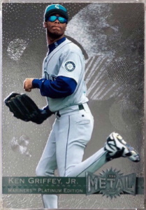
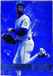
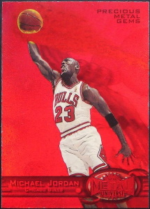
The story goes that Earl and Jean Arena, the husband/wife Creative Directors for Fleer/Skybox Corp. from 1990-2000, designed the inaugural 1996 Metal Universe set for baseball and established the Platinum Edition as the sole parallel for that set. Baseball was always the first sporting release of the calendar year and Jean typically used the baseball set to determine what could be improved for the football and basketball releases. This is why baseball collectors never got a Precious Metal Gems parallel, which was introduced in the football and basketball releases the subsequent year. To stay within my parameters, keep the parallel name but mimic the structure of the Precious Metal Gems from football and basketball: imagine these Platinum Editions having a blue holographic finish (see mock-up rendition above) and a serial number to 10; these could be at or above the 1996 Select Certified Mirror Golds in terms of desirability, rarity, and status by now. We baseball guys can dream!
Shop on eBay for 1996 Metal Universe
2. 1998 Ultra Masterpiece
Source of Inspiration: 1997-98 Ultra Masterpiece Edition Football Series 2
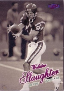
While nit-picky, this idea is seemingly a result of the continuous improvement stemming from the baseball release. The 1998 Ultra Masterpiece 1 of 1 parallel in Series 1 Baseball did not have any distinguishing characteristics from the Platinum Medallion parallel /100. However, in Series 2 Baseball, Fleer added a purple foil finish to the Fleer Ultra logo for Masterpiece distinction. Series 2 Football took that distinction one step further and featured Masterpieces with both a purple foil Fleer Ultra logo and a purple foil nameplate. Let’s push the envelope more: imagine the Masterpiece card-front surface having a slight purple tint in addition to the purple logo and nameplate. These would stand out even more and provide further distinction from the Platinum Medallions.
3. 1999 Topps Gold Label Red Label (All Classes)
Sources of Inspiration: Redesign for distinction, Jean Arena
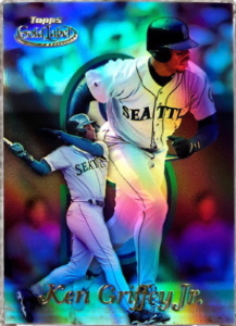
The Topps Gold Label Red Label parallels from both years are subtle and simple in design, featuring a red foil Topps Gold Label logo at the top of the card. Makes one wonder if the simplicity was intentional, to avoid distracting from the already stunning holofoil design of the base card. However, when I first saw these, I thought about how these could be distinguished further and what they could look like with a touch more design flair. Combining these thoughts with the colored acetate seen in a competitor’s parallel designed by Jean Arena (i.e., the Essential Credentials Future/Now), imagine these Red Labels featuring the same red foil Topps Gold Label logo but with a thin, red-tinted (instead of clear), acetate over the card-front to help these stand out just a bit more. These would still be relatively simple in design but even more eye appealing.
Shop on eBay for 1999 Topps Gold Label
4. 1995 Stadium Club Virtual Reality
Sources of Inspiration: 1995 Topps Stadium Club Super Skills and Power Zone sets
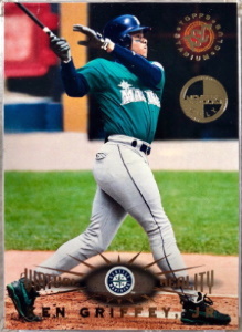
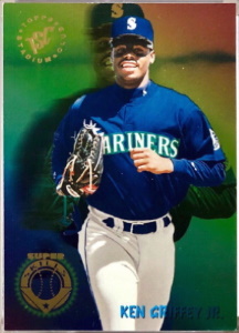
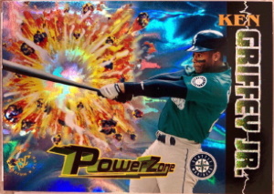
The 1995 Stadium Club Virtual Reality parallels are as functional as it can get for a parallel design, the only difference between these and the base are the words, Virtual Reality printed in gold foil around the nameplate. When I first read about these on the back of a pack wrapper, my mind raced with the possibilities of what a parallel with such a promising name could look like; then when I first saw one in a showcase, I was left wanting more. The set name conjures up a futuristic and colorful design that imaginatively warps one to different universe. Some design elements that evoke these thoughts were actually present in some inserts from the same release, specifically the rainbow foil used in the Super Skills set and the electric-like blue foil used in the Power Zone insert. Thus, imagine these Virtual Reality parallels with the same rainbow foil background from the Super Skills set but with a holofoil finish and a lightning bolt design emanating from the Virtual Reality text. This design would probably be over-budget for the brand but would look so awesome.
Shop on eBay for 1995 Stadium Club
5. 1994 Pinnacle Museum Collection
Source of Inspiration: Dufex
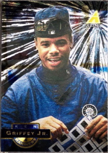
Pinnacle Brands, Inc. introduced its trademarked, one-of-a-kind Dufex printing technology to the Hobby in 1993 Select. This meticulous and handmade finish took months to produce for a specific set but was worth it as the design was an immense hit with collectors and is still popular today. Using the power of hindsight and seeing evolution of Dufex designs as the decade progressed, thoughts of how the flagship original could have been improved while still respecting the simplicity have always crossed my head. Thus, imagine these 1994 Pinnacle Museum Collection parallels with a gold Dufex finish and a print run of 1,500 (instead of the 6,500 actually produced), the parallel hierarchy would remain intact (i.e., Artist’s Proofs would still maintain the lowest print run of 1,000) and the Hobby would have been introduced to the range of the Dufex technology right from the start.
Shop on eBay for 1994 Pinnacle
6. 1999 Fleer Tradition Starting 9
Sources of Inspiration: 1997 Donruss Press Proofs, 1998 Pinnacle Inside Behind the Numbers
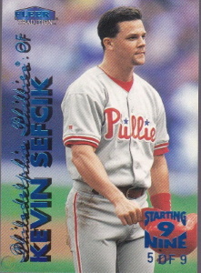
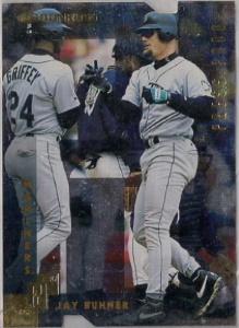
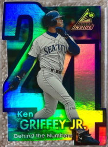
Fleer’s first foray into the ultra-rare, low serial-numbered parallel mix started in 1998 with its Vintage ’63 parallels numbered to 63. The subsequent year, they stepped up their game and set themselves apart with these 1999 Fleer Tradition Starting 9 parallels, aptly numbered to only 9. While the scarcity of this set was unparalleled for the time, the design was; basic. Featuring a bold and eye-catching blue foil to the nameplate and the serial-numbering on the front were nice touches to distinction but left me wanting more. There were other number-themed inserts from other brands the previous years, specifically the 1998 Pinnacle Inside Behind the Numbers set that first got my wheels turning on a possible redesign of this insert. However, the holofoil from this set may not have meshed with Fleer Tradition’s attempt at a more vintage look in its ’96-’99 releases. Thus, the 1997 Donruss Press Proofs, which used a die-cutting theme in the shape of the letter P and a silver foil finish (instead of holofoil) on the card front came to mind to use as an inspirational source for this hypothetical redesign. Imagine these 1999 Fleer Tradition Starting 9 parallels with the same blue foil on the nameplate and serial number stamp on the front but with matte-finish, which would allow the blue foil to stand out further and die-cutting around the edges to shape the card into a block-style number nine. The parallel would have definitive distinction while staying on-brand to the flagship theme and giving a subtle (inverse) nod to the Tiffany parallels from previous years.
Shop on eBay for 1999 Fleer Tradition Starting 9 parallels
7. 1999 Skybox Thunder Super Rave
Source of Inspiration: 1998 Circa Thunder Super Rave
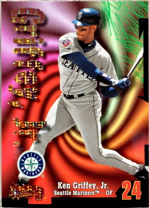
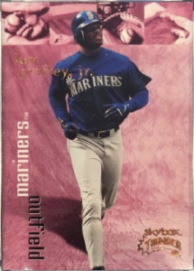
During the two-year run for the Circa/Skybox Thunder brand, Super Raves were the high-end chase set that also paralleled the base set. The inaugural year for Super Rave parallels was 1998 and featured a bold and unique brown-patterned foil across the large player nameplate that easily distinguished itself from the base or its sister parallels, Rant and Rave. The following year, the formula for the Super Rave foil design remained the same, which was great for internal brand consistency and recognizability. However, the base card design also changed in 1999 and featured a much smaller nameplate (compared to 1998) and a multitude of color variation backgrounds that drowned out the trademark foil design. To better appreciate this set, imagine Super Rave parallels with a nameplate that is 2-3x larger and a Super Rave-foil finish over the team name, position, and top of the card where the square-sized baseball images are. While these cosmetic changes could have proved to be more expensive with the extra foil usage, they would allow the Super Rave foil design to really stand out, regardless of the background color.
Shop on eBay for Super Rave parallels
8. 1996 Summit Above and Beyond
Source of Inspiration: Need for more appreciation
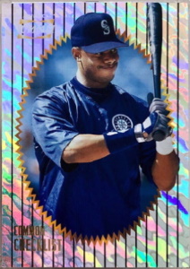
As the decade progressed, each card company created a slew of subset brands to meet the growing demand from hungry collectors wanting more inserts, parallels, and the innovative card design creativity that manifested on cardboard. Pinnacle’s Summit offering was a budget-friendly example that followed the template of its many other subset brands: a small base set, two parallel sets with one being Artist’s Proofs, and 4+ inserts that were increasingly more difficult to pull from packs with a feature insert that was the main draw to the set. Of all the chase cards in the set, possibly the most mesmerizing were the 1996 Summit Above and Beyond parallels and yet they were the easiest of all to pull. However, at first glance and not knowing anything about the other inserts/parallels available, one could think these were the highlight of the set due to its stunning, animal-striped silver holofoil finish on the card front. While Pinnacle’s Artist’s Proof parallels were generally the scarcest parallel regardless of the product, there were a few instances where they were outshined, literally, by its well-designed sister parallel (see: 1994 Museum Collection). Thus, imagine these Above and Beyond parallels being limited to a print run of only 150 (less than half of the print run of the Artist’s Proofs). They would gain the recognition they most certainly deserve.
Shop on eBay for 1996 Summit Above and Beyond
9. 1999 Bowman’s Best Atomic Refractor
Source of Inspiration: 1998 Bowman’s Best Atomic Refractor
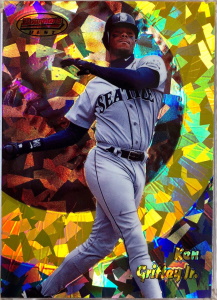
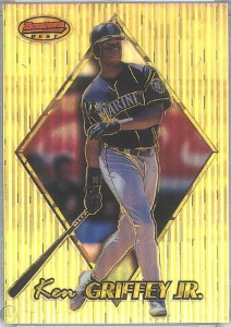
Topps first introduced the Atomic Refractor in 1996 and it became an instant hit with collectors. They represented a rarer and upgraded version of the base Refractor that was visually distinct and attention-grabbing. With each subsequent year, the Atomic Refractor design pattern changed and arguably reached its peak in 1998 with the “cracked-ice” finish that was utilized in the 1993 Donruss Elite Series inserts and is still used commonly in parallel designs today. Given the 3 consecutive, incremental, and successful years from 1996-1998, the parallel brand identity and reputation was riding high going into the 1999 release. However, the 1999 Atomic Refractor design left me wanting; a lot more. The cracked-ice pattern was (wisely) used again but repurposed in a way that drowned out its own beauty if you squint, you can see it used over the player nameplate, within the thin pinstripes running vertically down the card, and within the border of the diamond design (or home-plate design of the Best Performers subset). Thus, imagine these Atomic Refractors with a cracked-ice design all around the diamond/home-plate shape on every base card. This would be a simple, yet dramatic change for these that would act as an encore to the 1998s by celebrating its genuinely stunning look.
Shop on eBay for 1998 Bowman’s Best Atomic Refractors
10. 1995 Upper Deck Electric Diamond Gold
Source of Inspiration: Redesign for distinction
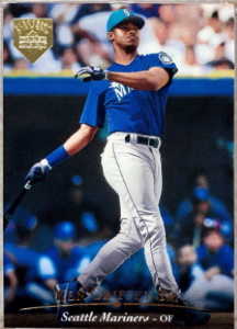
1995 Upper Deck Electric Diamond Gold parallels were intended to be a scarcer, more sought after parallel than its standard silver Electric Diamond counterpart. With this distinction, some collectors (i.e., your author) tend to envision a rarer parallel having a standout design and/or definitive distinction from either the base set or a lower-hierarchy parallel. While these succeeded in being harder to find, there was much left to be desired with the design. These Gold parallels were difficult to distinguish between the base, silver foil parallel under certain lighting conditions, especially through scans/pictures used on eBay and were overly simplistic. Thus, imagine these Electric Diamond Gold parallels with a brighter, more yellow-gold foil over the parallel logo and nameplate; further, if the size of the parallel logo was increased to one-fourth the size of the entire card front, the proposed yellow-gold foil would shine brightly (like a diamond, ha), helping the card distinguish itself while staying just inside the simplistic design theme for this set.
Shop on eBay for 1995 Upper Deck Electric Diamond Golds

 Visit our store


Amen on Virtual Reality. I remember being excited as well, and when I packed one out I was just confused. I assumed I didn’t get whatever the gimmick was.
The Above & Beyond is a tough call. That’s what made Summit a favorite of mine was that A&B was so attainable. It made me want to buy more boxes and try to put the set together. But at the same time there’s no legacy with Summit for the very reason Rodney stated. There’s probably room for both, such as simply making a gold-tinted version that’s #’d to 150.
Right? On the Virtual Reality parallels, right? And I hear ya on the A&Bs – the attainability of these combined with their mesmerizing design were really appealing. I like your idea of making a separate, gold-tinted /150 to allow the base A&B’s to maintain their follower base and the gold-tinted versions to for the rare-chasers.