Today’s product review takes us back to another mid-’90’s release. This time, we’re looking at the hobby release of 1995 Pinnacle Baseball Series 1. Pinnacle was really starting to hit its prime in 1995 with another inclusion of the two parallel sets that combine both beauty and scarcity. The Museum Collection (which was later renamed, Starburst) and the ever famous Artist’s Proof
parallels. Additionally, 1995 Pinnacle hosts a variety of army strong insert sets like Upstarts, White Hot and Team Pinnacle to name a few. With dufex technology and limited print runs, 1995 Pinnacle scores high in my book’s measure of quality assurance. They did it right.
The Packaging:
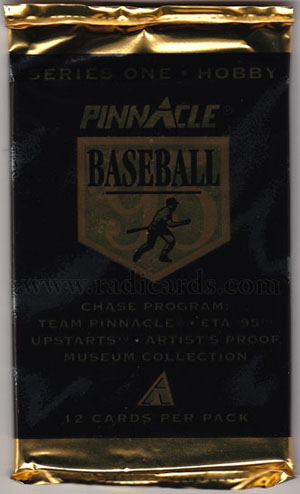
With a combination of gold and black foil, the packaging promotes a feeling of high-esteemed quality and class. It almost feels as if this packaging could pass as a Cooperstown promotional. Maybe it’s just me but for some reason, a slogan akin to, “Never forget the class of Cooperstown with a pack of 1995 Pinnacle” seems to wash ashore as I revisit this packaging design. The simplicity of the text and overall minimalism of the foil here really adds to the mystery behind the wrapping. For its time, it’s strongly alluring. Whenever I think of Pinnacle, I think of class and innovation, two characteristics often exhibited by companies of high-quality and competition.
The Contents:
Due to the darkness of the packaging, scans are very arduous to discern. My efforts were at least valiant.

Eyes hurt yet? Yea, mine too…
This is the only disadvantage that I could see, (no pun intended) of using dark foil and small gold text. Let’s look at the yield. As I opened this 16 year old package of cards, I found myself prying the cards apart as they adhered themselves together from the routine climate changes that take place year after year. That coupled with the high gloss finish on these cards makes for a laborious pack break. Regardless, the cards are still fully intact and look just as they should.
The Base Design:

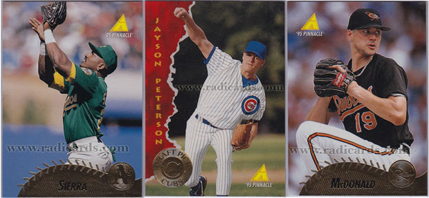
I love what they did here with the baseball stitching concept, brilliant! The gold foil name plates reflect a thing of the ’90’s but I’m still a fan. The gold foil on an asymmetrical portion of the card really provides for optimal aesthetics. The full, bright and lucid color photos pop out in combination with the gold name plates and draft-pick logos. A simple design that does the trick as it presents incredibly well even after all these years.

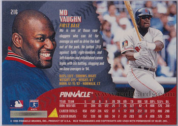
The backs of these cards are again full of life and emotion. With classic player action photos, head shots against the teams color theme and short biographies, there’s a lot that meets the eye when you flip the card over for further investigation. Another nice touch here is the varying text fonts. I’ve always been partial to using a variety of text sizes and fonts as it helps differentiate the numerous messages being conveyed. This tactic also helps the reader maintain a sense of interest as there is a wealth of details to guide the viewers point of focus. I really admire this type of work.
Final Thoughts:
1995 Pinnacle comes wrapped in chic and tastefully classic packaging. One disadvantage is that stated odds on the reverse side of the package are considerably difficult to read but that shouldn’t concern the buyer as the contents within vastly makeup for this minor set-back. With bright color photos and pleasant gold foil baseball stitching name plates, the fronts of the base cards provide an amiable viewing experience. But that’s not all, the backs are moderately peppered with focal points and colors which provides the reader with many options for eye placement. 16 years later, 1995 Pinnacle Baseball still hails as a stepping stone from a legendary brand.
To see what’s currently on eBay from 1995 Pinnacle, click here.

 Have you visited our store? Click here.


